The Visions of Ron Herron – Reyner Banham – Architectural Monographs No. 38 1994
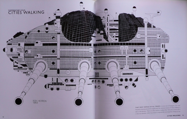
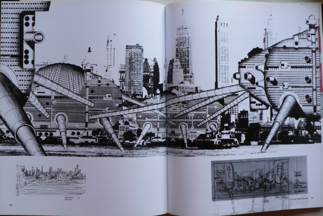
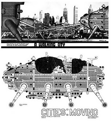
THAT MOST FAMOUS OF ALL IMAGES to come out of Archigram, the most frequently reproduced and the longest-lived, the canonical version of 'Cities Walking', is seen in flat elevation. There are other versions, invading New York and so forth, but it is that true elevation which has proven so reproducible and long-lived, finding its way into most of the histories or commentaries on Modernism that take any notice of visionary design.
One testimony to its power as an image was its use on the poster and catalogue cover for the haevy-metal show of modern architectural drawings, VISION DER MODERNE, at the German architecture Museum in Frankfurt in 1986. The other important one is that major-league pundits like Sigfried Giedion, the architectural historian, and Constantinos Doxiadis, a Greek urban theorist of great weight in the 1960s, both took it seriously enough to attack it for representing an 'inhuman' urban vision. But [one said to Giedion] it's only a drawing! It's not that serious!' 'Who would make such elaborated a elaborated drawing if he did not want it to be taken seriously?', the earnest Swiss countered — and in a way he had a point. It is indeed 'elaborated', labour-intensively so (try counting all those windows!) and drawing is still a very serious business in architecture.
Furthermore, like all the best Archigram images, it is intensely and precisely detailed, so that even when you have worked out that the apparent geometry makes any movement of the legs impossible, your imagination can still visualise this monster; surely descended from those in The War of the Worlds, advancing relentlessly over land and sea, intent on its rendezvous with destiny in the East River, under the shadow of the Brooklyn Bridge.
The only thing that can have made it fearsome was the proposition that it should move … after all, the period envisaged far vaster fixed projects, such as Tange's proposal to build all over Tokyo bay (of which Doxiadis apparently approved). One or two even got built, as at Cumbernauld in Scotland. Clearly, it was felt that something the size of a city centre should know its place, in the townscape, in history, and in Western culture, and not offer to amble off in the night and show up in Philadelphia in the morning.
It was the first major manifestation of the mixture of technological high-spirits, urban sessive draftsmanship that has characterised all the best work from Ron Herron's cunning hand.
Its place in his oeuvre is assured. In the intellectual history of 20th-century architecture it seems likely to endure as a kind of landmark to a shift in sentiment, taste, weltanschauung, or something. Because what got crushed under the mighty feet of this stalking vision was not 'humanity' but the empty claims of the 'functionalism' that had once been the driving energy of modern architecture, but had since become a paralysing inertia in the hands of the acadamies and the establishments.
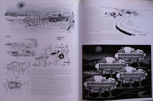
The old libidinous mechanical kraken of Modernism had re-awakened and raised itself from the placid waters of the dead sea of current architecture, and the panic was on. Had the panicked hung around a bit, they would also have seen that marvellous, witty and life-enhancing later drawing of four or five walking cities gathered together in friendly interlinked intercourse…WALKING CITY
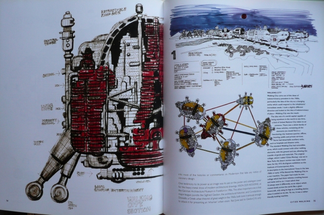
Walking City came out of the ideas of indeterminancy prevalent in the 1960s, particularly the idea of the city as a changing entity which could respond to the inhabitants' immediate needs. I took a slightly different direction and looked at the idea of indeterminacy of place — Walking City was the result.
The idea was of a world capital capable of being anywhere in the world at any time, a kind of United Nations City taken to an extreme. There was a whole family of these vehicles, containing all the elements you would find in a functioning city: business quarter, offices, housing, public and private services. Some had detachable auxiliary units, such as hospitals and disaster units.
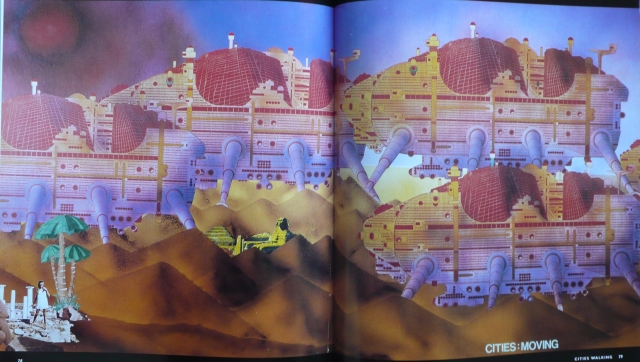
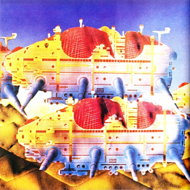
The standard Walking City had extendible arms, which could connect with other walking elements, with the ground and sea, allowing the transfer of goods and materials. The original collage, which I called 'Cities Moving', was set in New York; the desert version was made much later, for the 1973 Archigram exhibition at the Institute of Contemporary Arts.
A description in the International Times in the late 1960s or early 1970s likened the Walking City to a war machine. The paper had made its own collage which had these vehicles crushing houses and tanks and so on. I must admit that I'd always seen it differently; as an object which moved slowly across the earth like a giant hovercraft, only using its legs as a levelling device when it settled on its site. To me, it was a rather friendly-looking machine.
See more images at the Archigram Archive Project here.

The theme of walking cities was used in Philip Reeves' Steampunk books "Mortal Engines", "Predators Gold", Infernal Devices", and "A Darkling Plain".